Telling a Story About Private Equity
Overview

The final homepage design.
Catalyst, a private equity company based in New York City, wanted a full website redesign that would do a better job of telling their story as an innovative and dynamic investor in growing technology companies.
WHAT I DID
I was responsible for UX, including research and creating all wireframes for both the homepage and internal pages. I also collaborated with a visual designer on the final mockups.
SIMPLIFYING THE NAVIGATION
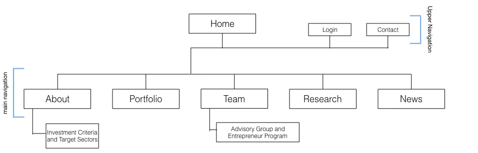
I started with a competitive and comparative analysis, followed by a Google Analytics review. I determined that the main users were CEOs and investors and created personas that illustrate the needs and goals of this group. In terms of the information architecture, my goal was to streamline the navigation and increase usability. I combined several pages that contained related content. I also separated the navigation into an upper utility navigation and a main navigation, in order to prioritize the main navigation items.
increasing visual appeal on the Homepage
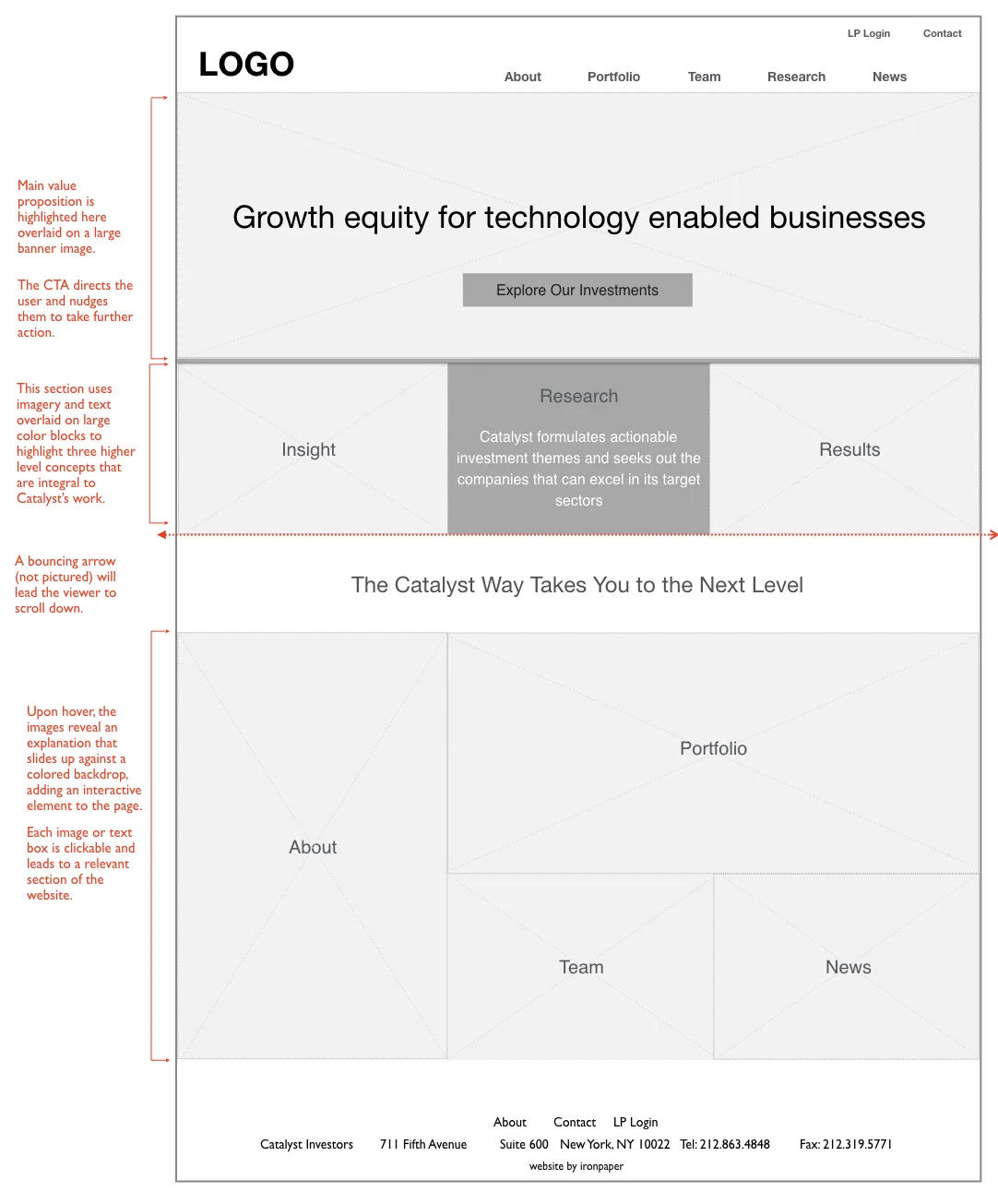
Previously, the homepage had a simple layout consisting of one large image and three icons to illustrate the company’s core pillars: Insight, Research and Results. There was very little information below the fold.
In our new design, we used large, attractive images to increase visual appeal and evoke a feeling of affluence appropriate to the financial sector. We also added interactive elements in order to create a sense of technological savvy, reflecting the client’s focus on investing in high-tech companies, and added a call-to-action button to the hero image section to direct users to the company’s portfolio page.
While designing the bottom section, I was inspired by competitor websites that featured image mosaics. This section, made up of large, clickable images, highlights different areas of the company and provides links to different sections of the website.
highlighting the portfolio of investments
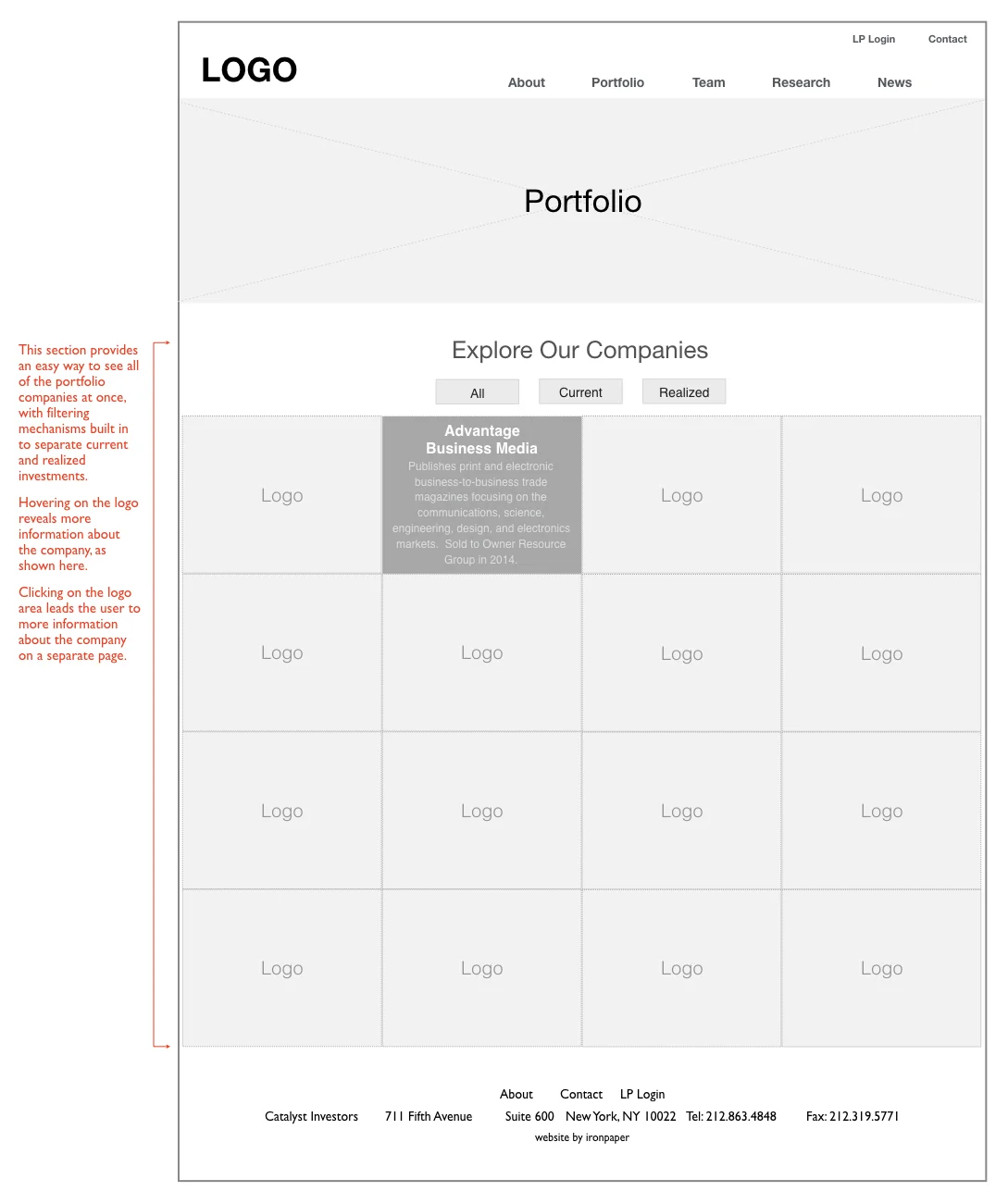
The portfolio page wireframe.
An important part of the redesign was the company’s portfolio page highlighting all of their past and present investments.
I decided to present all of the companies using large, interactive panels featuring a logo and a brief summary of the company upon hover. The panels are also clickable and lead to the featured company’s homepage.
There are three buttons that filter the companies according to current and realized investments.