Making it Easier for Audience Researchers to Gather Feedback
OVERVIEW

The new dashboard design.
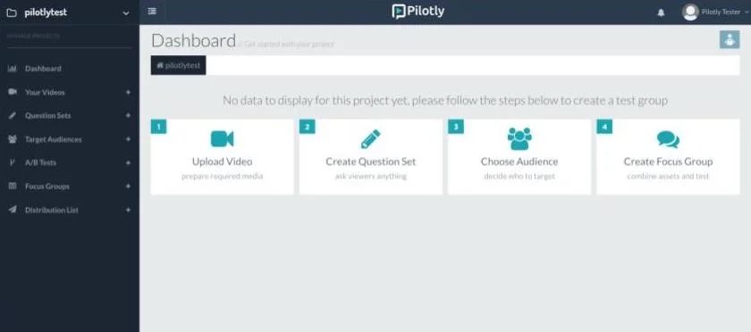
The old dashboard design.
Pilotly is a company based in Oakland, Calif., that enables media researchers to rapidly gather feedback from online viewers. Their all-in-one platform allows researchers to upload media content, create studies online, choose audiences, distribute studies, view results in a data dashboard and analyze data.
The Problem
The team was spending too much time inputting data because clients could not use the platform without assistance. I was asked to overhaul the design of the entire produce, with a major focus on the goal of enabling clients to create, distribute and analyze studies on their own.
WHAT I DID
I was the first designer on a team of six engineers and data scientists. I worked on all research, usability testing, UX and UI. I also worked with an intern to develop a new visual language and create a brand style guide.
how i did it
I implemented a Lean UX process that involved research, prototyping, usability testing and multiple iterations.
user testing round 1
I started the project by conducting user testing and user interviews with five participants. All were young professionals with some prior experience using survey creation tools online.
Decarlos, 31
Nathan, 34
Ofo, 24
Rohini, 34
Blair, 34
I gave each participant the following scenario before giving them tasks to complete in the existing platform:
You are a network television research executive working on gathering audience feedback for a new television series called “The Tap,” a drama that follows several students at Yale University in 1969. You are planning to screen the pilot episode to a group of testers and survey them using Pilotly, an online platform for content creators that allows you to run digital focus groups.
My intent was to observe the participants while they tried to log into the platform, create a new audience study, upload the media files and survey contents, and finally publish the study to make it available for their audience.

After studying the videos of their testing sessions, I put together a rainbow spreadsheet in order to compare different user pain points and find trends. It was clear that most of the negative feedback had to do with the overall flow. It was clear that the most common sentiment from users was that the overall flow was confusing and didn't provide enough of a sense of where users were in the process of creating a viewer study.
Competitive/comparative research

Because the product was designed to do several different things, I had to look at a variety of tools for inspiration.

One inspiration was the video website VHX (now part of Vimeo), because it is also a platform that allows users to upload video and provides data analytics. One area where I drew from their design was in the navigation. I thought that the two-tiered, horizontal navigation scheme looked clean and simple compared to the existing navigation that featured a prominent left sidebar navigation.
Navigation

The first part of the user interface I worked on was the navigation. The old navigation was confusing and unnecessarily complicated. I decided to streamline the navigation and ended up experimenting with dozens of variations.

Although there were other revisions as we started wireframing the other sections of the product, the version above, featuring a two-tiered horizontal navigation, was more or less the version that we decided to follow.
LOW-fidelity mockups
After the navigation and visual brand was set, I started designing with Sketch and produced low-fidelity screens for all of the major parts of the study creation process. I then created a prototype of the overall flow using Marvel.
High-fidelity mockups
After studying the user tests we conducted on our low-fidelity prototype, I started creating high-fidelity screens in Sketch. In addition to the overall study creation flow, I created screens for login/signup, user onboarding, user profiles, the subscription process, notifications, media uploading, the data analysis dashboard, and more. Below are a few examples:
User profiles

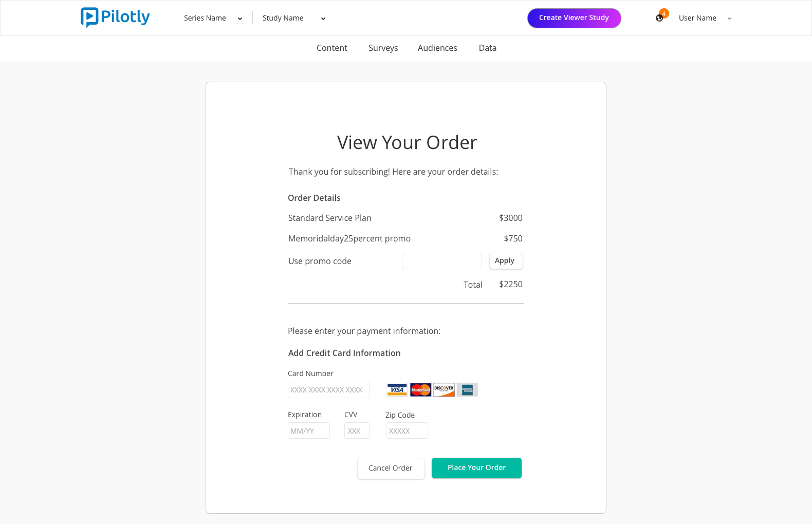
Subscription flow
Upload video

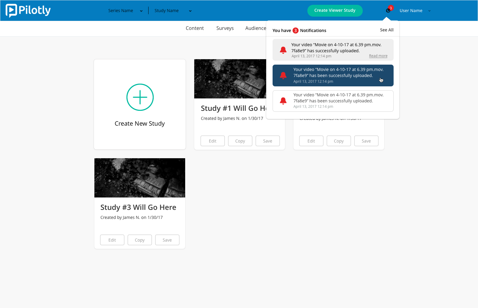
Notifications
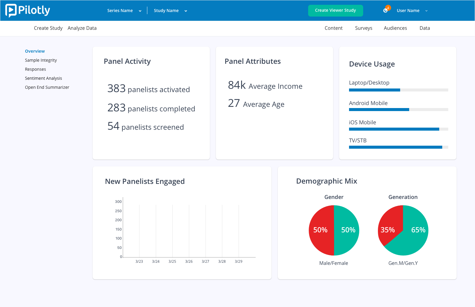
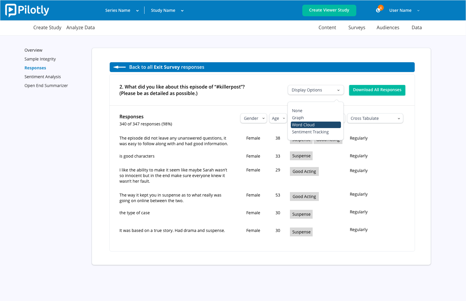
Data dashboard overview
Data dashboard survey responses
final usability tests
After our final round of testing, we found that most of our participants were able to go through the process of creating and distributing a viewer study with limited assistance from the Pilotly team.